
 |
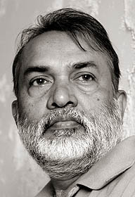
Artist Samir Mondal's most amazing contribution is a continual revival of water colour. He has endowed water colours with the status of oils, projecting a facet of water colour that was never visualized before. The artist keenly observed the characteristics of oil-painting, noted the inherent quality of oils, their richness and substance. In his endeavour to include these elements in water colour, he developed textures and structural features as if they are oils. Samir Mondal has stood the test of this fantastic versatility. His water colours have never lost their originality, their innovativeness and their classic elegance, yet they are truly modern paintings. An alumnus of Government College of Arts, Kolkata, Mondal has held numerous solo shows and participated in many important group exhibitions in major cities around the world. Below is an excerpt from L'Art de l'Aquarelle, where Samir Mondal speaks about his changing thought process through his career and his different styles of work |
|

An Artist’s style reflects his character and identity. I am talking about one’s own individual style, which may refer to the distinctive visual elements, techniques and methods that typify an individual artist's work, their visual language as it were; or to the movement or school that an artist is associated with. I also think style is something one should have: It becomes a commitment to contribute something definite to the art world. Not something an individual should strive or struggle towards, but should develop with time and become part of one’s character, just like a distinctive handwriting.
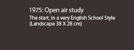
My style of work has evolved, being influenced by events in my life since birth. During my early childhood in rural Bengal we played and experimented with natural pigments like ash, red clay, flower petals, leaves etc. Mixing such pigments with water, we made drawings and decorative patterns. Water and pigments have always been a part of me from the start. Later I moved to Kolkata to pursue higher studies in Government Art College. This was another big influence in the evolution of my style. Government Art College was a very British institute, so I was exposed to orthodox watercolour techniques of the British masters. The transparency and the magical three dimensional aspect of watercolour enthralled me as I began my student life. Landscapes, cityscapes open air study were the only subjects related to watercolour use. As I progressed through the years in college, I was exposed to Chinese watercolours with bold brush strokes, Egyptian hieroglyphics with simplified motifs, prehistoric cave paintings, frescoes from Ajanta Caves in India etc. These made me realise that in contemporary use of watercolour, it was still very much unexplored, not only in India but the world as a whole. I tried to experiment by incorporating bolder brush strokes, inspired by the Chinese; also by placing simplified motifs in a two dimensional plane
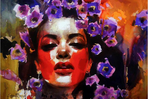
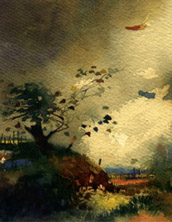
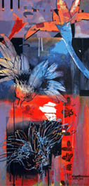
Banalata
This is from the series ‘Dhusar Pandulipi- The Faded Manuscript’, on poems of noted poet Jibanananda Das. I tried to capture the romantic and surrealistic mood of the poetries in an abstract environment. (56 X 76 cm)

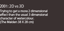
Traditionally watercolours were always characterised by a soft weightless feel and a foggy appearance to create a soothing illusion of perspective and depth. I tried my best to stay clear of this, and break the traditionalism by incorporating definite structure and bolder colour to my style. I guess to understand the evolution of my style, it’s important to understand the very character of watercolour painting. Every brush stroke involves some sort of modulation and variation in pigment deposition, unlike oil painting which is uniform throughout a stroke. This character was used to represent outdoor themes and landscapes as close to reality as possible. But today with a camera, which can truly represent perspective and dimension flawlessly, I thought of moving away from the traditional application of watercolours and to use the two dimensional space of my paper with motifs and play with the lack of perspective depths.
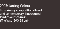
During my learning phases, I was overwhelmed by the works of many western greats, from the simple everyday objects and vibrant colours of Van Gogh to the bold and dynamic visualisation of Robert Rauschenberg. From impressionist visualizations to Fauvism of Henri Matisse, all these great workers and their works have had a huge impact in developing my style. None of them used pure watercolour to express themselves. So I tried to incorporate the modern visual language into a new medium. I tried to use simpler everyday motifs, bolder structured forms and strokes, compose abstract areas with more detailed subjects in the same plane, use absurd and vibrant colours, etc. In fact some of my works reflect the treatment of colours and structural quality associated with oil paintings rather than watercolours, this is one of the conscious efforts to diverge from the traditional watercolour applications.
Also I tried to experiment with the size of the paintings. I have done some really massive works in watercolours to give the powerful and dynamic visual appeal one associates with other mediums. My style today involves the influences of different cultures, themes, styles and techniques that I have been exposed to throughout my career. They are forever evolving, learning from the medium itself. I love the accidents and unpredictability of the medium, the happenings from the mixing and merging of the medium beyond our control. I am merely guiding these processes to a meaningful conclusion.
 |
 |
|
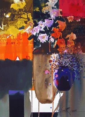
The Vase #4 |
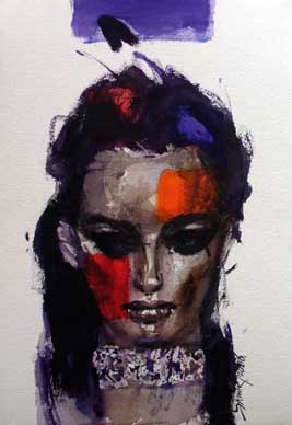
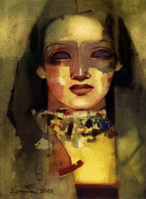
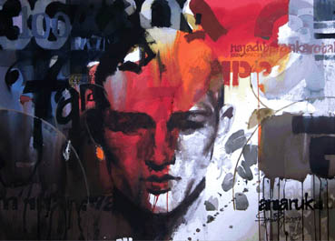
She This work is from the period when Indian girls started dominating the international fashion world. I was obsessed with not only the glamorous girls’ beauty but also their attitude against conservativeness. I tried to capture this mood of glory. (56 X 38 cm) |
THE EVOLUTION OF MY PAINTINGS
The future of my works is very much related to how they have evolved. Every day I learn from all that happens around me, all that happens when I put brush to paper and when exposed to different styles of work. Criticism from others could lead me to a different style of work. But I believe the biggest deciding factor about the evolution of my style is the unpredictable nature of the medium. I start out expecting or anticipating a certain result, but the outcome is sometimes far from what I initially set to achieve. I do not consider this as my failure, but a positive new knowledge for me. I have incorporated this in my style as well, the unpredictability of watercolours. The medium itself is creating the work as much as myself. As I said before, watercolour is a very powerful and interactive medium, when I work I feel at peace in a sort of meditative trance. I enjoy the melody that it sings to me, the array of tones, the mixing, and the merging; all have a sort magical and spiritual feel to it. Spirituality may creep into my themes in the near future. I would also like to work something related with my cultural roots, smaller sized works with more details. Something that I am concerned about is the preservation and conservation of the art works.
ABSTRACTION AND MYSTERIOUSNESS
I look at a work as an assembling of many abstract forms, some meaningfully detailed and some just random shapes, and compose them in an abstract totality of the work. Abstraction in totality brings a sense of mysteriousness and leaves a room for interpretation by the viewer. Inspired by the greats of western art world and modern urban society, most of my recent works involve consciously juxtaposing absolute unrelated symbols and motifs, and composing them in a single plane to end in a logical conclusion. I consider my handling of abstraction and more detailed work as similar to Pop or Trance music, which incorporates sounds from different worlds to create a whole composition. I love the challenge to unite mismatched motifs and subjects from our urban society.
I started off watercolours as I was taught in school: that is to use transparent layers and creating three dimensional illusions of landscapes with wide open skies. These were the basics of the watercolour technique, which till today has not changed much. As soon as I felt this medium was meant for me, I wanted to experiment and diverge from the traditional use of watercolours.
 |
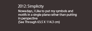
In my quest to diverge from the tradition, I started using 2D structured works instead of the 3D effect of traditional watercolours. This meant I had to put strong symbols and motifs in a single plane rather than putting them in perspective. This probably led to the development of simplified shapes. Simpler shapes meant that the audience would have fewer stories to interpret and more time to enjoy the play of watercolour. I minimise the characters in my works so that I can have more time to play with the colours in the painting. I also like the directness that simpler motifs and shapes reflect. I use them directly and straight, in the centre of the composition and use colours and other patterns to break the monotony. Simpler forms keep me free at times to improvise with the watercolour medium, rather than the story telling factor and I feel they give a bold and attractive appeal to the composition.
|

 |
 |
 |
|
 |
 |
 |
|
 |
 |
||
 |
 |
||
 |
|||
 |
|||
MY WORK DICTATES COLOUR CHOICES THE USE OF BLACK AND WHITE |
PAPERS COLOURS |
|||

| ONE-MAN SHOWS | |
| 1982 Basirhat, West Bengal 1983 Academy of Fine Arts, Calcutta 1984 Basirhat, West Bengal 1984 Kala Yatra,Madras 1989 Bajaj Art Gallery, Bombay 1989 K. C. Das, Bangalore 1990 Sophia Duchesne Art Gallery, Bombay 1991 Galerie 88, Calcutta 1991 Jehangir Art gallery, Bombay 1992 K. C. Das, Bangalore 1992 Galerie 88, Calcutta 1992 Masterpiece Art Gallery, New Delhi 1994 Renaissance Art Gallery, Bangalore 1995 Prithvi Art Gallery, Bombay 1995 Galerie 88, Calcutta 1995 Jehangir Art Gallery, Bombay 1995 Renaissance Art Gallery, Bangalore 1996 Renaissance Art Gallery, Bangalore 1997 Galerie 88, Calcutta 1998 Jehangir Art Gallery, Bombay |
1998 Renaissance Art Gallery, Bangalore 2000 Prithvi art Gallery, Bombay 2000 Renaissance Art Gallery, Bangalore 2001 Jehangir Art Gallery, Bombay 2002 Jamaat Art Gallery, Bombay 2002 Renaissance Art Gallery, Bangalore 2002 India Habitat Centre, New Delhi 2003 Art Indus, New Delhi 2003 Gallery Sumukha, Bangalore 2003 Amethyst, Chennai ( by Sumukha ) 2004 Jamaat Art Gallery, Bombay 2004 Shrishti Art Gallery, Hyderabad 2006 Jamaat Art Gallery, Bombay 2007 Ki Gallery, Kuala Lumpur, Malaysia 2008 Jehangir Art Gallery, Bombay 2008 Jamaat Art Gallery, Bombay 2012 Jamaat Art Gallery, Bombay 2012 Gallery Sumukha, Bangalore 2013 Aakriti Art Gallery, Calcutta |
SELECTED GROUP SHOWS
National Art Exhibition of Lalit Kala Akademy, New Delhi • Academy of Fine Arts, Calcutta • Birla Academy of Art, Calcutta • AIFACS, New Delhi • A.P.Council of Artists, Hyderabad • West Bengal State Academy • KalaYatra: Goa - Madras - Bangalore • Lalit Kala Academy: Karnataka - Orissa • Bombay Art Society Centenary Show • People For Animals: Bombay - Delhi • ‘BOMBAY’ and ‘50 Years of Independence’ by RPG Enterprises • ‘Harmony Shows’ by Reliance group • ‘100 Years of Indian Cinema’ by Lakeeren, Bombay • ‘Watercolours’ by Gallery Espace, Delhi · ‘Pages from my Diary’ by Sans Tache Art Gallery, Bombay • ‘Celebrations-97’at Napa Art Gallery, Nepal • ‘Confluence’ at Art Connoisseur Gallery, London and Gallery Asiana, New York organised by Gallery Sumukha, Bangalore • ‘ Jesus Christ’ at National Gallery of Modern Art, Bombay • Anniversary show of Jamaat, Bombay • Gallery Sumukha, Bangalore • Art Indus, Delhi • Art Musings, Bombay • ‘Bombay Artists-Progressive Perspective’ and ‘Self Portrait’ at National Gallery of Modern Art, Bombay • 'Art of Bengal' and 'Works on Paper' by CIMA, Calcutta • Colours on Canvas, Dubai • Pao Art Gallery, Hong Kong • Golden Jubilee of Jehangir Art Gallery, Bombay • Asian Art Fair, Singapore • The Art on Paper Fair at the Royal College of Art, London • Ki Gallery, Malaysia • The Ueno Royal Museum, Tokyo • The Royal Watercolour Society, London and many other group-shows all over the country and abroad.
COLLECTIONS
National Gallery of Modern Art, Delhi • Archaeological Museums of Karnataka • RPG Enterprises • Morarjee Mills • Brooke Bond • K.C.Das, Bangalore • Peerless • Reliance Pvt. Ltd.• Citibank • Calcutta Club • Qwality Inn, Calcutta • Tata Steel • Birla group of companies • ICI India Ltd. • Benson & Hedges • Rolta India • Ministry of External Affairs, India • Russian Consulate, Calcutta • Standard Chartered Bank • Office of Star Plus • DSP Merrill Lynch • Solomon Smith Barney India Ltd. • J P Morgan • and many private collections in India and abroad.
ART CAMPS AND WORKSHOPS
Children Book Trust, Delhi • Poster for Drama by National School of Drama • Artists in residence -- an Indo-US workshop on art and science • Workshop by Lalit Kala Akademy, Karnataka • Conducted Watercolour Workshop organised by Birla Academy, Mumbai • RPG Art Camp at Madh Island, Mumbai • Oberoi Art Camp at Oberoi Hotel, Mumbai • Monsoon Magic--an art camp by Leela Kempinski at Leela Palace, Goa • Artists Entente, Dubai • Seminar on ‘Productivity through Creativity’ at Numaligad Oil Refinery, Assam • Media & Methods--workshop on material behaviour in art, organised by 'the art club', Mumbai • With children for Akanksha Foundation, Mumbai • Art camp in Dubai • Art camp in Mauritius • Art camp in Australia and Bangkok • Art camp in Kenya • Art camp in Israel • Art camp in Egypt • Art camp in Russia • Art camp in Morocco • Art camp in China • Art camp in Japan and other workshops at many art colleges and art institutions.
AWARDS
Govt. College of Arts, Calcutta -1970, 1972, 1973, 1974 • Academy of Fine Arts, Calcutta -1978, 1983 • West Bengal State Academy -1979, 1983 • AIFACS, New Delhi -1986 • A.P.Council of Artists, Hyderabad –1995 and others.
copyright © Samir Mondal 2001 | 301 Orion-C,Vasant Galaxy, Bangur Nagar, Goregaon West, Mumbai 400 090, India.
Phone: (+91) (22) 28798694 |
email:.mondalsamir@gmail.com